Plotting
Time-resolved diffraction measurements can benefit from careful plotting, especially
for time-series of data. This tutorial will go over some of the functions that make this easier
in skued.
Colors
Time-order
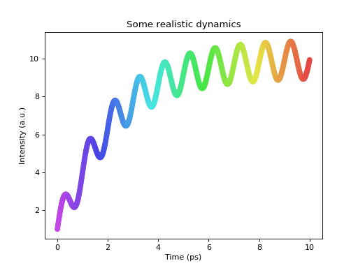
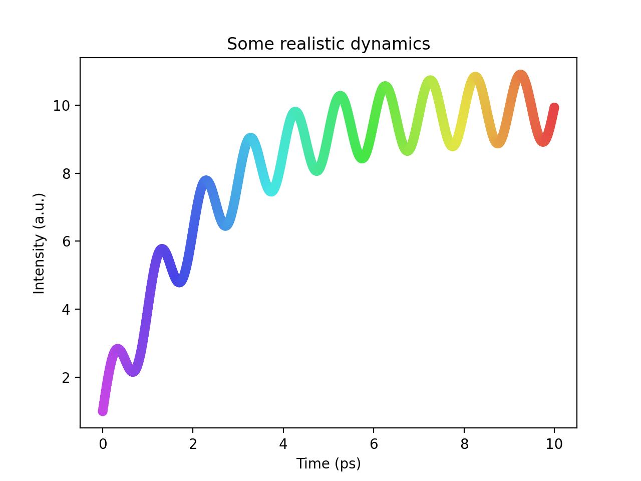
Time-resolved data possesses obvious ordering, and as such we can use colors to enhance visualization of such data.
My favourite way to plot time-series data is to make use of rainbow colors to indicate time:
(Source code, png, hires.png, pdf)

This functionality can be accessed through the spectrum_colors() generator:
>>> from skued import spectrum_colors
>>>
>>> colors = spectrum_colors(5)
>>>
>>> # Colors always go from purple to red (increasing wavelength)
>>> purple = next(colors)
>>> red = list(colors)[-1]
You can see some examples of uses of spectrum_colors() in the baseline tutorial.
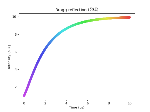
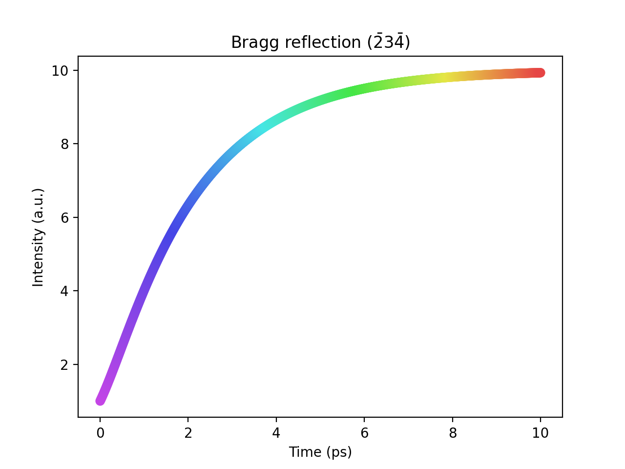
Miller indices
Miller indices notation in Matplotlib plots is facilitated by using indices_to_text(). This function renders
indices in LaTeX/Mathjax-style, which is compatible with Matplotlib:
>>> from skued import indices_to_text
>>> indices_to_text(1,1,0)
'(110)'
>>> indices_to_text(1,-2,3)
'(1$\\bar{2}$3)'
Here is an example:
(Source code, png, hires.png, pdf)
